New look for the blog
It loads well in Firefox, slightly slower in Internet Explorer, ok with Browsar, but don’t ask me about Safari or Netscape or any other Browsing tool because I haven’t checked them out. Big thanks to Pam at Random Bytes for a simple 3 column layout that actually works. You are getting the credit in my links sidebar.
Another new item, hopefully coming up next week or maybe the week after is ‘Walking the Streets’ merchandise. You will be able to purchase special ‘Walking the Streets’ designed mugs, sweatshirts and T-Shirts from Cafepress.com, the proceeds from which will (Please) help support this blog. So much more dignified than sticking up a PayPal ‘donate’ button.
Incidentally, don’t whine at me because I chose Cafepress as a supplier, they just seemed to fit the profile of my current and future requirements better than anyone else out there at the moment, even if they are USA based and a bit (Reputedly) leftwards inclined politically. Their stuff comes highly recommended in terms of quality. In the words of the Ricky Nelson song – “You see ya can’t please everyone – so you got to please yourself.”
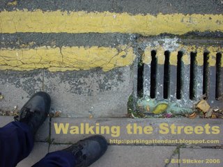
See the proposed merchandising graphic below. I think it’s rather apt.


7 Comments:
I like the new layout - much cleaner
Works great in Safari.
Excellent merchandising graphic.
katy
Thanks for the link, Bill. Glad my template could help!
I'll second Katy there. Works fine in Safari, as well as Firefox and IE for the mac.
Oh and are you planning on using the graphic in the template at all? It looks good.
Good look!
Don't feel a PayPal button looks bad every time. Look for example at how Steve Pavlina's (google) site does it. Not undignified at all, IMHO.
Post a Comment
<< Home